3 Image formats that get more reach than carousels
You don’t need a 10-slide carousel anymore. Images now get most traction on LinkedIn.
Here’s how I make them work.👇
ShieldIndex data on 50,000+ posts shows that image posts now get the most impressions, ahead of text-only, labor-intensive carousels and polls (and of course the worst performers: reposts, although reposts are starting to perform a little better than before).
But back to my point: Over the last four months, image reach has stayed around 14%, while text, carousels and polls have all gone down.
That combination of highest typical reach and highest stability makes images a very attractive format.
But image is a broad term. It’s not quote cards or AI images that typically do well.
So what type of images should you be posting?
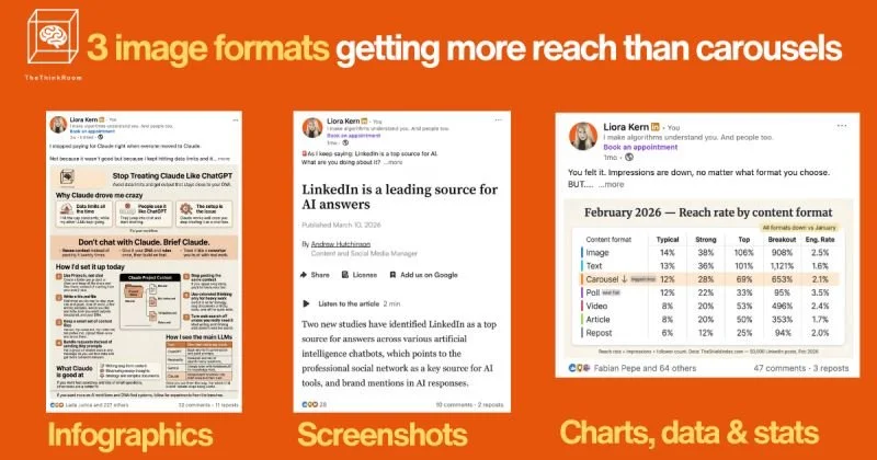
1️⃣ Infographics that are helpful.
The goal is to make them so useful that people will want to save them. My infographics are saved 50, 100, sometimes 850 times.
Focus on one core idea, broken into clear sections and micro-headlines. AI has gotten great at creating them. Write the brief, then share an example, your colors, and then ask it to leave space so you can add your logo and headline at the end. (Yes I know I just said AI images aren’t good but AI infographics are different if done well.)
2️⃣ Screenshots.
A screenshot of a post, comment, or DM (with consent) that already got engagement. Something you read on LinkedIn, X, Instagram or the newspaper (credit!).
Works well when you add your own relevant and ideally spicy comment. Think things you'd send to your best buddy.
My top performers are these types of posts. If you keep them related to your niche, they can help you get a lot of followers, and the right ones.
3️⃣ Simple charts, data and insight stats
A single table, chart, or number that tells a story on its own. Again: Help your audience. Make it so useful they will want to save it and come back to it.
Regardless of which type is used, high-performing visuals usually follow the same principles:
* One message per image (if there are three ideas, that’s three posts)
* Aggressive visual hierarchy
* Big, clear headline.
* 2-4 supporting elements.
* Plenty of breathing room.
* Clean shapes, consistent colors, obvious structure.
* But it’s fine if it looks like you made it yourself.
The job of the visual is to win the first second of attention.
The job of the text (caption) is to add nuance, context, and a reason to comment or save.
Remember: The visual stops the scroll, the hook makes people click "more",